Monday, October 25, 2010

ANDRE DE BEER WORKSHOP, CREATIVE FIGURE DRAWING


On the 16th october we had a wonderful day with Andre de Beer.
He is a very well known South African artist whose work is of a very high standard, and he loves to depict people in his paintings. His drawing skill is fantastic and his caricatures are very entertaining.
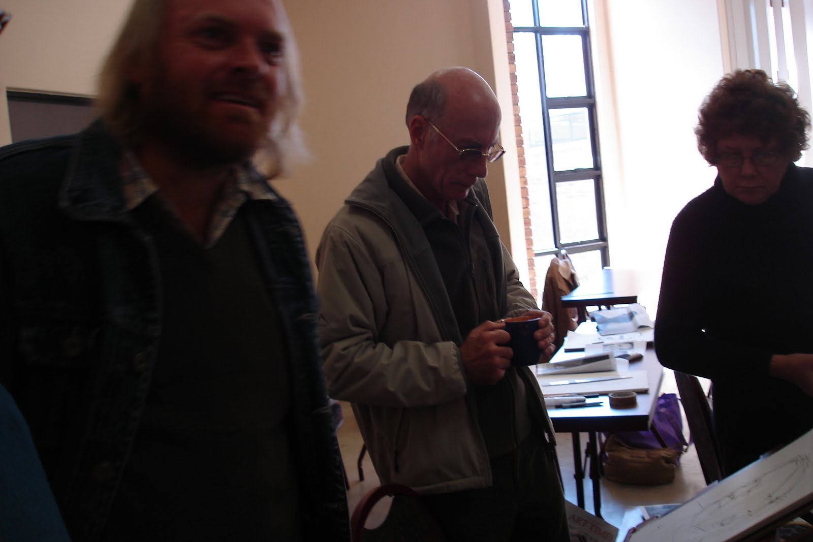
We were very privileged to have him come and share some of his knowledge with us. He also brought several paintings and books of sketches and his fantastic caricatures of the Bulls.
Andre started off by saying "open your eyes". Look around you and draw what you see. use pens and always carry around paper. Pencils encourage you to erase. By using pens you begin to put down what you see the first time. Sketch, sketch and sketch some more Where ever you go and where ever you are look around and sketch.
You can draw anything from plants, trees, dogs, cats, people, buildings etc. Also take you camera and take photos of street scenes, restaurants,the shopping malls, sporting events etc.
Draw all the time and develop your own style. Choose the accent line and put that down first then work in the rest, See something in your mind- how he is bending his elbows or his knees .
We drew a man taking the size of the head and working with that size to create the body of the man. The head goes into the body 8 times. From the top of the head to the chin- 1, from chin to breast-2 from breast to waist-3, from waist to crutch-4, from crutch halfway to knee-5, from halfway down the leg to just below knee-6, and from below the knee to halfway down shin-7 and from halfway down shin to under the foot is 8. This is a good measurement although is slightly different in some people. Children have different sizes to measure with and babies have bigger heads. A babies head measurement is used 4 times when about one year old.
We then drew stick figures showing movement and then filled it in. We did several running, bending, walking etc. We drew faces side and front view.
He also helped us see movement by showing us how he moved. Andre walked around to all of us and gave out help and encouragement.
Andre gave advice by saying we must use our whole are to draw not just your fingers. He also told us to draw all the time, using pitt pencils, pens and charcoal. Do Not Erase.
We all enjoyed it. he is an inspiring teacher and we produced so really exciting and good results. He invited us to come and visit his studio and gallery. I look forward to that sometime next year.
As usual there were great eats to be enjoyed by all. During the lunch break we had our branch AGM.

Dont forget that our next meeting is on the 20th November. We are all meeting and going over to Norscot manor. This will be an exciting and very interesting meeting. hope to see you all there.

Tuesday, October 5, 2010

SPRING FLOWER DEMO


We asked three of our accomplished artists to show us how they approach a painting and then demo how they apply the paint. They were given the same reference material. The artists were Helen Lamprecht and Lois Sangari and Jeanie Wallace.
Helen drew hers onto a fairly large piece of stretched paper. Further back leaving more space in the foreground. And she saved the whites using masking fluid. And added more daisys into the foliage and around the vase. She also painted a dark back ground.
Lois used a smaller size paper with her drawing more in the foreground and the marmalade jar was the focal point. With her foliage being painted all at one time. Her painting was set with a light back ground.
Jeanie's painting was smaller and almost finished in the afternoon. I do apologise for not being able to describe the painting but I did not get to see it. I was away and only got to see the others at Zanne's class.
People were able to walk around watch and listening to the artists.

Cheryl Curnick--Interseting Techniques


On the 21st of August we had a very exciting and interesting meeting with Cheryl Curnick.
Cheryl is a long standing member of the Watercolour Society of which she also was the chairman. She is an Associate and a fellow.Cheryl is an establish art teacher and has developed new and exciting techniques, some of which is not found in books
One of the helpfull things she showed us was to make our own coloured paper for collages Use Butcher paper on a board For colour use acrylic paints or Ink and Bleach. Mix watery colours and paints onto paper. You can add bubble wrap to make a pattern and allow to dry. or add other colours. Or you can wait until almost dry and turn it over onto another piece of paper creating a print type pattern.On another piece of thin buthcher paper you can paint on Quink Ink blue or Black. Spray on Jik bleach Allow to almost dry and turn and press onto more paper. All the paper can be used and you can use the "printed" patterns.These can be torn or cut into any shape and used on your collage.
Other ideas were to cut out pieces from magazines or wrapping paper paint with glue, gel medium, and put onto a board. Work up a painting with different pieces even adding pieces from scrap booking or card making.
You can make cut outs from contact paper. Cut out you shape and stick on contact paper. Spread a glob of glue with two parts sand into the space and spread using pallette knife. remove contact paper and see the shape is correct and when semi dry add texture with tooth pick. You can paint over this.
Another idea is to use foam board. Put a pattern onto the surface with toothpick. paint onto pattern with thick brush and paint. lay over paper and roll.
We all had a good afternoon and loved her paintings.
There was a very good crowd of us and everyone brought eats so there was plenty to go around.Good company, good art and good food.

Saturday, August 21, 2010

PORTRAITS; PAINT TOGETHER


Centurion Branch held a workshop on the 17th july. Portraits: Paint together by Alma Vorster and Liz Davies.
Alma brought some of her lovely Sepia portraits and one where Pit pencil and watercolour were used and one with charcoal over the water colour.
Alma had some very good informative notes written up for us. About choosing the type of portrait, the medium, paper, color,and style; She included the colours to use for various skin types and hair; How to do shadows, hard and soft edges, modeling the nose painting the eyes in three stages and preserving the whites and first wash.
How to get interesting effects with different drawing mediums. Alma gave a demo on using Pit Pencil and using water colour over it. We found the effects very exciting.
A tip from Alma for beginners; Use transparent, non staining colours such as Aureolin, Rose madder Genuine, Cobalt Blue, Viridian, Raw Sienna and Burnt Sienna. Transparency will prevent mud forming and non staining colours on good paper can be washed out if necessary.
Some good reference books from Alma.
Hands,Faces and Figures by Angela Gair
Painting People in Watercolor - A design Approach by Alex Powers
Interpreting the Figure in Watercolor by Don Andrews
Painting Portraits in Watercolor by Jan Kunz
painting beautiful skin tones with color and light by Chris Saper.

I brought several portrait paintings to show everyone my style . I am a colourist with bright colours and dark darks. I often use a green red colour way.
I made copies of the various stages of painting the portrait of my little grand daughter. This was to show how I go through the stages from drawing, adding masking and several glazes to doing the back ground in dark and light colours.
We asked everyone to bring a drawing or photo copy in A4 size. This was then applied to the watercolour paper by drawing or tracing.
The next stage was to put in the masking on the lights in the eyes, on the hair and maybe a little on the lips.Then the first glaze of Raw Sienna was applied to the portrait but leaving some of the ares white. Then once this was dry the next glaze of Alizarin was applied. Again always waiting for the paper to dry completely, the next glaze of cobalt blue was added. Then some of the shadows around the nose, eyes and under the mouth were put in with a violet while the paint was damp allowing it to flow smoothly.
Never leave the teeth or the white of the eyes the white of the paper. Use the first glazes of colour over them.
The back ground was painted with water and colour was dropped in with the paper being moved around. You could add several colours to make a dark dark. e.g. Winsor Green (blue Shade) with Alizarin. this method was used to add colour to some of the clothing.
Alam and I walked around giving help and advice. Everyone came away with a painting almost finished. People enjoyed it and had learnt some new ways. It was a great afternoon. Centurion branch you rock!

Wednesday, June 23, 2010

PORTRAITS; 'GETTING A LIKENESS' by Willie Jacobs


On saturday 19th june we had the most fantastic workshop with Willie Jacobs. Drawing portraits can be scary and frustrating but Willie got good results from all of us.
We had to bring A4 black and white photo copy. Paper and Charcoal sticks or pencils or if we preferred 6B-8B pencils. Willie tapes a piece of charcoal on to a pencils so he has a long reach when drawing.
Place the head on the paper and make negative angles using your arm not wrist. Make light angles to form shape of face, no curves. slowly put down lines of hair along face and outside shape. add neck.
Willie explained about the measurements of a face. The face can be divided into three, the top of the head to the eyebrows, from the eyebrows to the bottom of the nose and from the bottom of the nose to the chin. The line for the eyes is the middle line across the face. The mouth is halfway between eye line and chin. Willie than added the pupils, marks for the side of the nose and the corners of the mouth. When you smile the edges of the mouth are the same distance apart as the pupils. And the distance from the corner of the mouth to the pupil is the same length as from pupil to pupil.This distance is the same as from the mouth line to the chin and from the bottom of the nose to the eyebrow line Half way down from the bottom of the nose and the chin is the lower line of the bottom lip. The middle line follows down the curve of the face to the left or the right of the nose to show the direction of the face. The face is egg shaped. Men have heavier jaw lines, woman have a higher forehead and small children have all their features below the halfway line. Willie then demonstrated how to draw eyes, noses, and the mouth.
Willie explained that he uses the method John Howard Sanden has developed for portraits. "there is agreement among top portrait painters that a persons likeness is dependent on the proportional relationships between facial features, not specific shape of nose, mouth, ears or eyes. That is the location of the eyes is more important than the colour or the shape of the eyes'. And he uses his painting formula.
We then drew in the features hair etc. Willie walked around encouraging us and giving a helping hand.
After lunch Willie explained about the colours he uses. He divides the head into the bands: yellow or golden for the forehead; Warm rosie or ruddy from the eyes down to bottom of the nose: Cooler Blue, grey or green with orange on the chin. Willie went on to show us how he painted in oils using shapes of colour. He marked of the pupils, corner of nose and corners of lips with a dark colour. He then painted the eyes forehead working down to the nose and mouth, cheeks and eventualy the chin and neck And as he was doin this he added back ground colour to show up the lighgter areas on the face and hair. He added the darkest shadows then finished the hair and the clothing.
Even if you do not work in oils this was a wonderful workshop to watch as you could use so much of what we learnt for your water colour portraits. We will be doing this next month at our meeting.
Willie gives a great workshop and if you have the opportunity of going to one do take it. We all had a lot of fun enjoyed ourselves and learnt a lot.

Wednesday, June 2, 2010

NOTES FOR JUNE CLASSES

NOTES FOR JUNE CLASSES

Zanne has given us a challenge to think about for the duration of the month of June. She would like us to produce a painting based on the following quote from Winston Churchill. There will be an entrance fee for the challenge of R20 which will be placed in a tin for a lucky draw.

'Happy are the painters for they shall not be lonely. Light, colour, peace and hope will keep them company to the end, or almost to the end of day.'

Also in June we are asked to develop a theme around which we can base our paintings. It is a good idea to collect your thoughts, ideas, sketches and put them together in one note book. Zanne showed us an example in class of what Alma has done so far. She has chosen the theme of 'HANDS' and all her ideas have been organised together in a file.

The Rules for your work during June!!!

A. You must produce a thumbnail of you proposed work. This will help you to clarify composition and tonal values in your final painting.

B. Think about the 5 steps in watercolour methodology
1.Leave whites
2.Work from top to bottom of the page
3.Work from big bruhes to small.
4.Work from light and dark
5.Add detail last.

C. When applying glazes you will always work from light to dark and transparents to opaques. When in doubt work using the following order of colours
Yellows
Reds
Blues

Variations on your personal theme:-Choose 3 primaries to paint your picture.
Consider the temperature of the primaries and do the following
WEEK 1: Use 2 hot colours and one cold
WEEK 2: Use 2 cold colours and one hot
WEEK 3: Use cold muted colours
WEEK 4; Use hot muted colours

REMEMBER JUNE 16TH IS A PUBLIC HOLIDAY. WORK HARD!!!

Monday, May 24, 2010

Centurion watercolour abstract meeting.


Hi everyone, We had a really great afternoon on the 15th May. It was an Abstract workshop by Ingrid Kolzing, There was a good turn out of about 20 people and we all had good fun.
Ingrid started off by giving us 2 definitions:
i "Abstract art is a visual language of form, colour and line to create a composition which may exist with a degree of independence from visual references in the world.This departure from realism can be slight partial or complete."
ii "Artistic content depends on internal form rather than pictorial representation."
She went on to describe "hard" or "soft abstracts." Ingrid gave us some examples like; abstract expressionism: Jackson Pollack - with the emphasis on spontaneous(automatic).
Willem de Konings - violent and grotesque.
Wassily Kandinsky: - "although it is true that spontaneity or the impression of spontaneity characterized many of the abstract expressionists' work, most of these paintings involved careful planning, especially since their large size demanded it."
Paul Klee, Emma kuntz.
Rothko - abstract art implied to them expression of ideas concerning spiritual and unconscious mind.
Franz Kline, Barnett Newman, Matisse, Leger, Mondrian.
The 21st century themes are: transcendental, contemplative and timeless.
In Abstract art you are working on a 2 dimensional plane. Objects are flattened out. Colour is purely used to the artists preference or feeling (emotion) and is not in a realistic way.
Creativity: Try new things.
Accept risks.
Remain open to surprises.
Never concentrate on errors.
Good paintings release a soul vibrating- creativity with the viewer.
How to go about it.
What fascinates you? Become more sensitive and in tune with your inner thoughts and feelings.
Spend time thinking
Spend time observing.
Spend time listening.
Painting really comes from within and not just coping what you see. painting is a way to place our energy, feelings and soul before the viewer. To be a good painter you need a unique and personal way of seeing that this comes from within, look for it and discover it, this different way of interpreting. NOT COPYING.
You must know your medium and how to use it. This knowledge gives you more freedom and allows you to focus on what you want to say.
A painting tells a story; the story the artist wants to convey, even in an abstract painting.
Even if abstract art does not appeal to you, you will learn something from trying to paint an abstract successfully.
Find joy and fulfilment in this wonderful gift of painting.
Search for your own style and continually work on improving it.
Do not take criticism personally.
Ingrid then explained that we would work on 2 paintings at the same time. Firstly we put masking tape on the paper any where and any way we wanted to. Then we chose one colour and painted on a pale wash.
With the other painting we had to make 3 thumbnail sketches with a curve and a square and develop it. Once we had a composition we like we put it onto our sheet of stretched paper.
Once the first painting was dry we could add or remove the masking and add more colour. we continued with this letting the work dry in between. We could work on this with pastel, ink or pencils.
In the meantime we had been working on the planned painting. While we working on these paintings we were to think of them and get ideas about developing them. When we had finished we put all our work out and we enjoyed seeing some amazing pieces of work.

Thursday, May 20, 2010

May Newsletter

We would like to congratulate Ann Karstel, Susan Olmstead, Era Uys, Ilse Roux and Doug Thistlewhite from the Centurion Branch on their artwork being accepted for the New Signatures Exhibition in May at Norscot Manor Gallery.

The committee members decided not to participate in the Mothers Day Exhibition at the Pretoria Botanical Gardens on 8 May. Reason: late communication.

The Paul Botes workshop was very well attended and worth the fee.

ABSTRACT WORKSHOP by INGRID KOLZING

DATE: Saturday 15 May TIME: 13:00 – 16h30

PLACE: VOORTREKKER HALL, Glover ave. Between Lenchen ave and Gerhard str.

COST: R60 for non-members, R50 for members

WHAT TO BRING:

2 stretched sheets of your favourite watercolour paper; watercolour paint; masking tape; magazine on interior decorating; hairdryer; sketch book; pencils and other mediums to make texture marks e.g. charcoal, soft pastels, aquarelle pencils, polystyrene, net, toothbrush, spray bottle for water and anything you can think of.

Ingrid wants us to get the most out of the afternoon and will show us two ways to begin our abstracts. We know Ingrid as a fast worker, so drink your vitamins and be prepared to work! Joke! We can finish our abstracts at home. The idea is to try the two ways of beginning our abstracts. It will be one of those afternoons that we will really feel it was really worth the money we paid. One lesson, two art works can evolve.

People, who work in other mediums, should also be invited to our meetings by you. Share your paint and other goodies with them. Remember, it is ABSTRACTS. When they see how we play and spray (nice rhyme) they may decide to do only abstracts in watercolour and join our society! People often have this funny idea about watercolour and are amazed after one demonstration.

NEXT MEETING: 19 June; 9:30-16:00/16:30 at Auditorium. Portraits: Getting a likeness by Willie Jacobs. R150 for non-members and R 120 for members.

BRING OWN MUG & SIDE PLATE

Book your place with Ilse by Thursday, 13 May 2010. (083 407 8588) or Linda (0828960483).

Cheers, Linda

Friday, April 23, 2010

Welcome to the blog of the Centurion Branch of the Watercolour Society of South Africa.

Please bookmark this page and visit us often.

You can find out about what is happening at a national level in the Watercolour Society of South Africa by visiting www.wssa.org.za